Eleventy in a Box
A premium Eleventy starter kit for designers and developers who want to spend less time setting up the same project structure and more time designing distinctive websites.
The Academy of Scoring Arts just launched its new website. It’s a community of arrangers, composers, and musicians that helps industry professionals develop their craft through events and video tutorials.
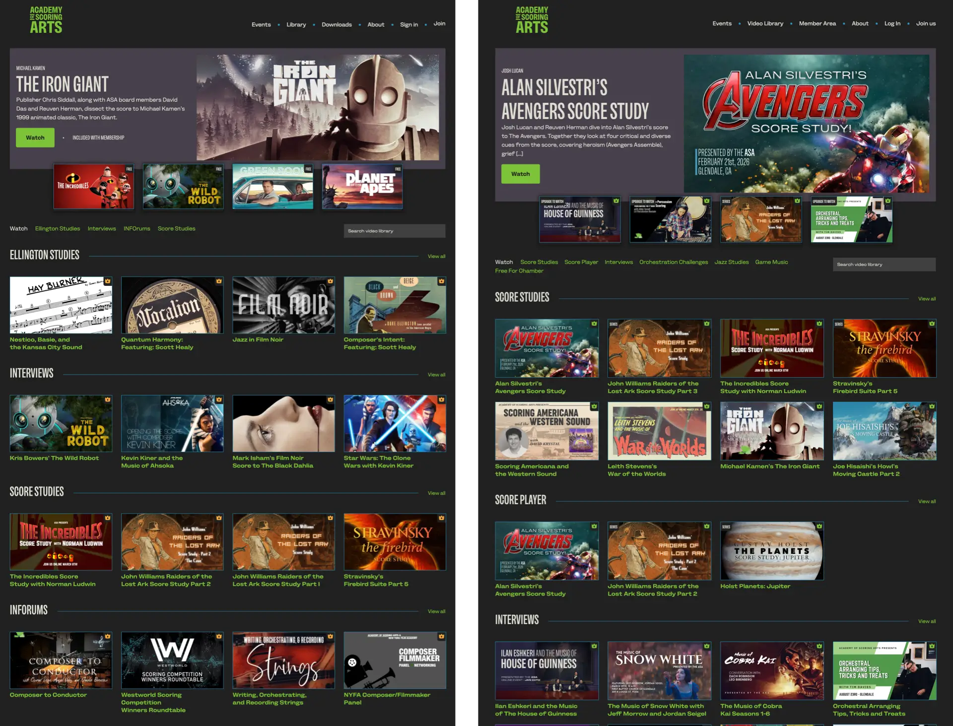
The Academy of Scoring Arts is for professionals at every stage of their careers, so the website needed to do more than present information. It had to clearly communicate the benefits of joining, make video content easier to discover and consume, promote events, and ultimately increase member sign-ups.
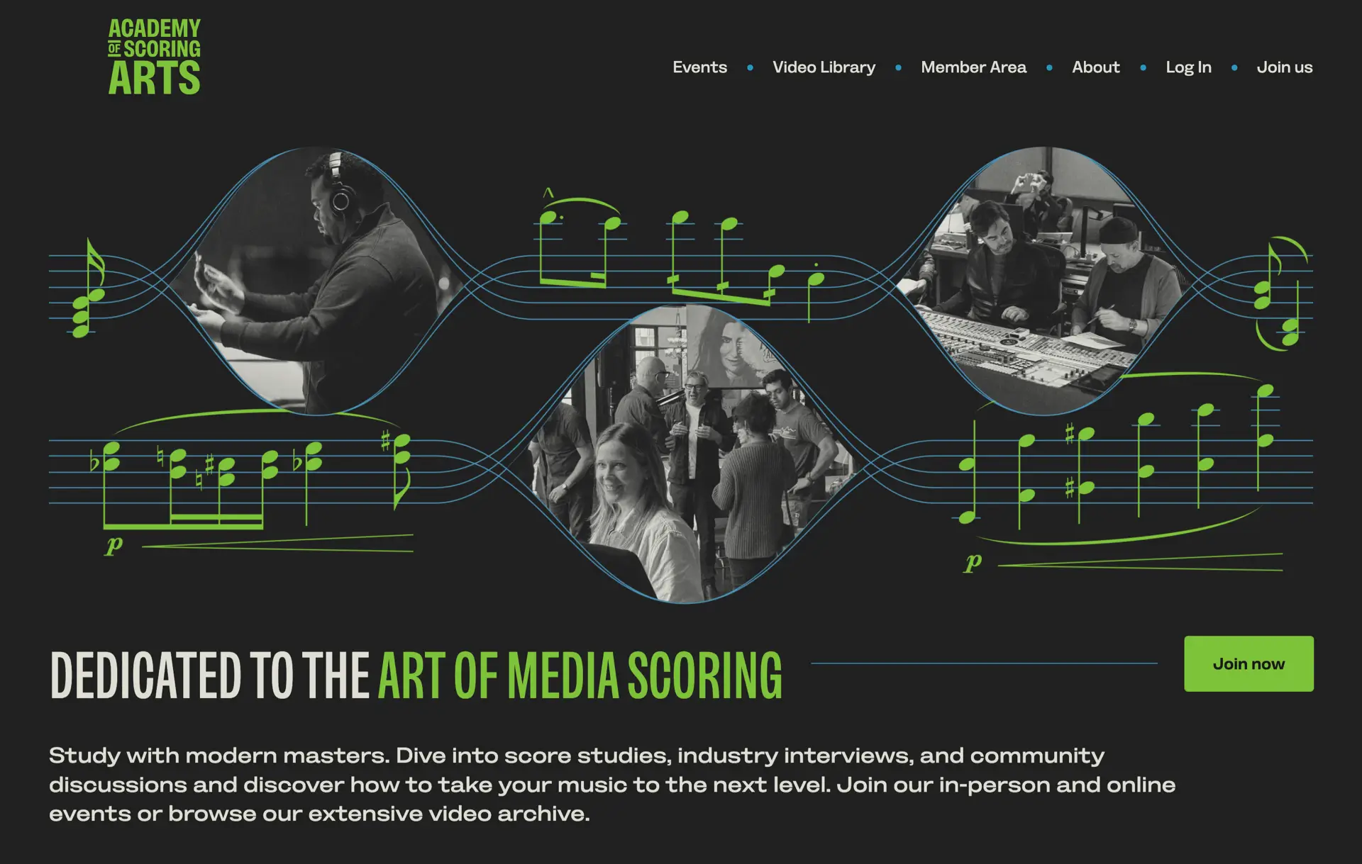
This was a redesign of a membership-focused website for a music organisation, with a strong emphasis on conversion, content discovery, and editorial-style layout. The Academy of Scoring Arts’ previous website felt bland and dated. It lacked a clear visual identity, and the benefits of joining weren’t obvious. I wanted to change that. The new design is bold, confident, and more expressive—better reflecting the energy of the Academy’s community while still looking professional.
That meant walking a fine line between personality and professionalism. Too safe, and the design fades into the background. Too expressive, and it risks undermining trust.
Type plays a central role in the design. I chose Bankside Sans by Dalton Maag. It’s an early British grotesque reinterpreted for modern use, with clear letterforms that give it authority, while its extreme widths add impact and flexibility.
I used it to establish a strong, consistent voice across the site:
The result is a design where type isn’t just functional, it’s a defining characteristic.
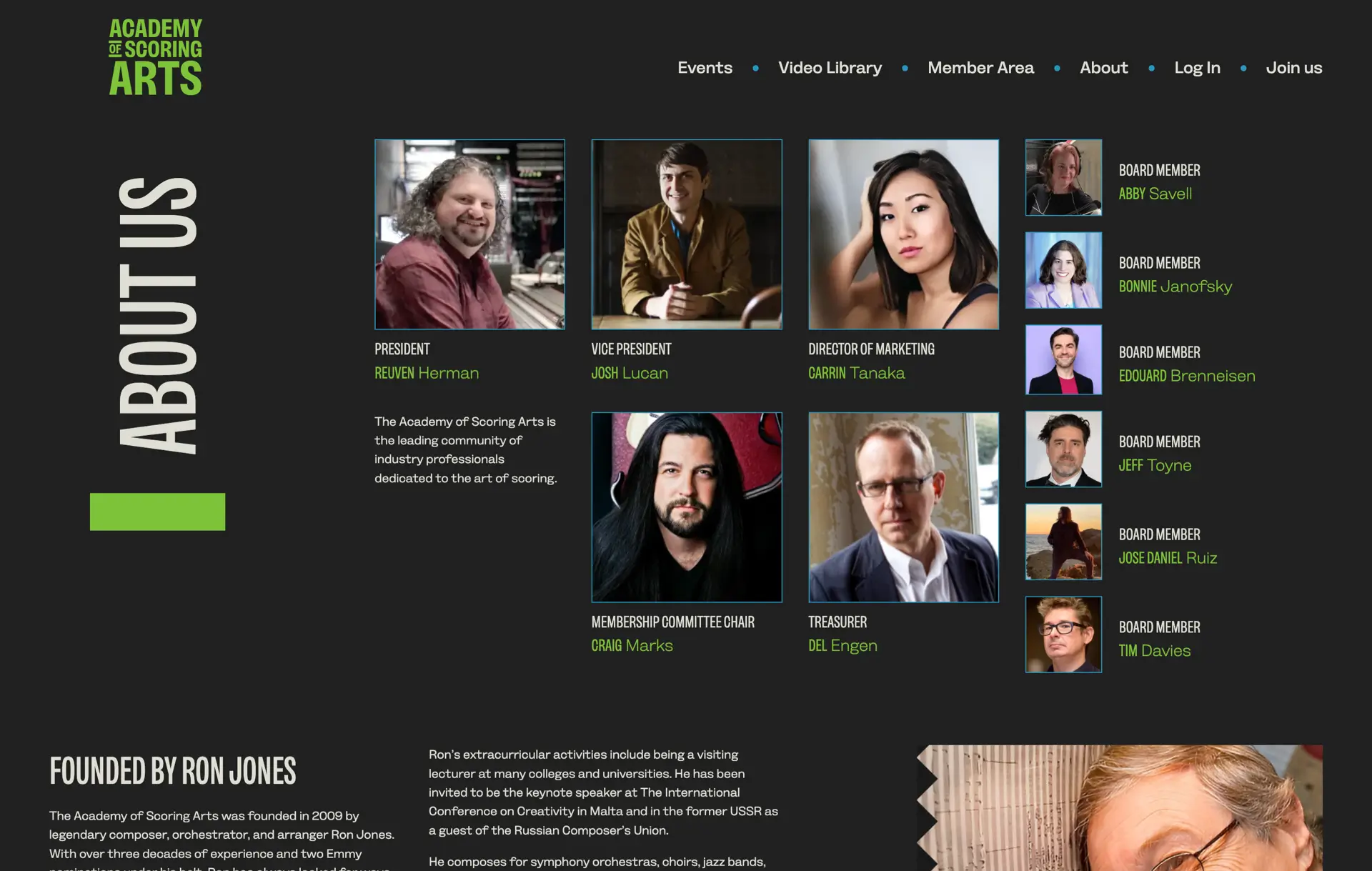
The colour palette I chose is deliberately limited. Light and dark form the foundation, with just two accent colours used sparingly. There’s no shading or visual noise—everything is clean, direct, and intentional. This restraint helps the typography and layout do more of the work, and gives the site a confident, considered feel.
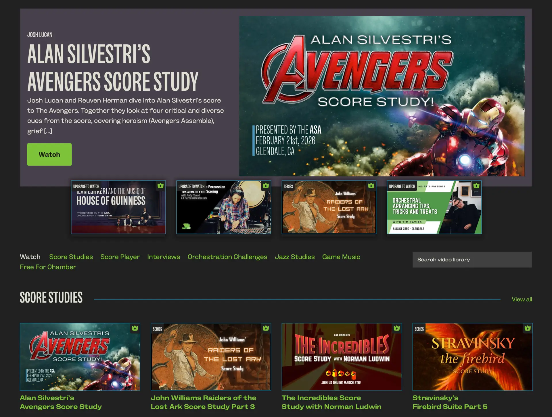
Unlike some of my more expressive work, this design uses a straightforward 12-column grid. But within that structure, I leaned heavily on modular, editorial-inspired layouts—particularly for the video library and gallery.
These modular systems:
It’s a reminder that even a conventional grid can feel distinctive when it’s used with intent.
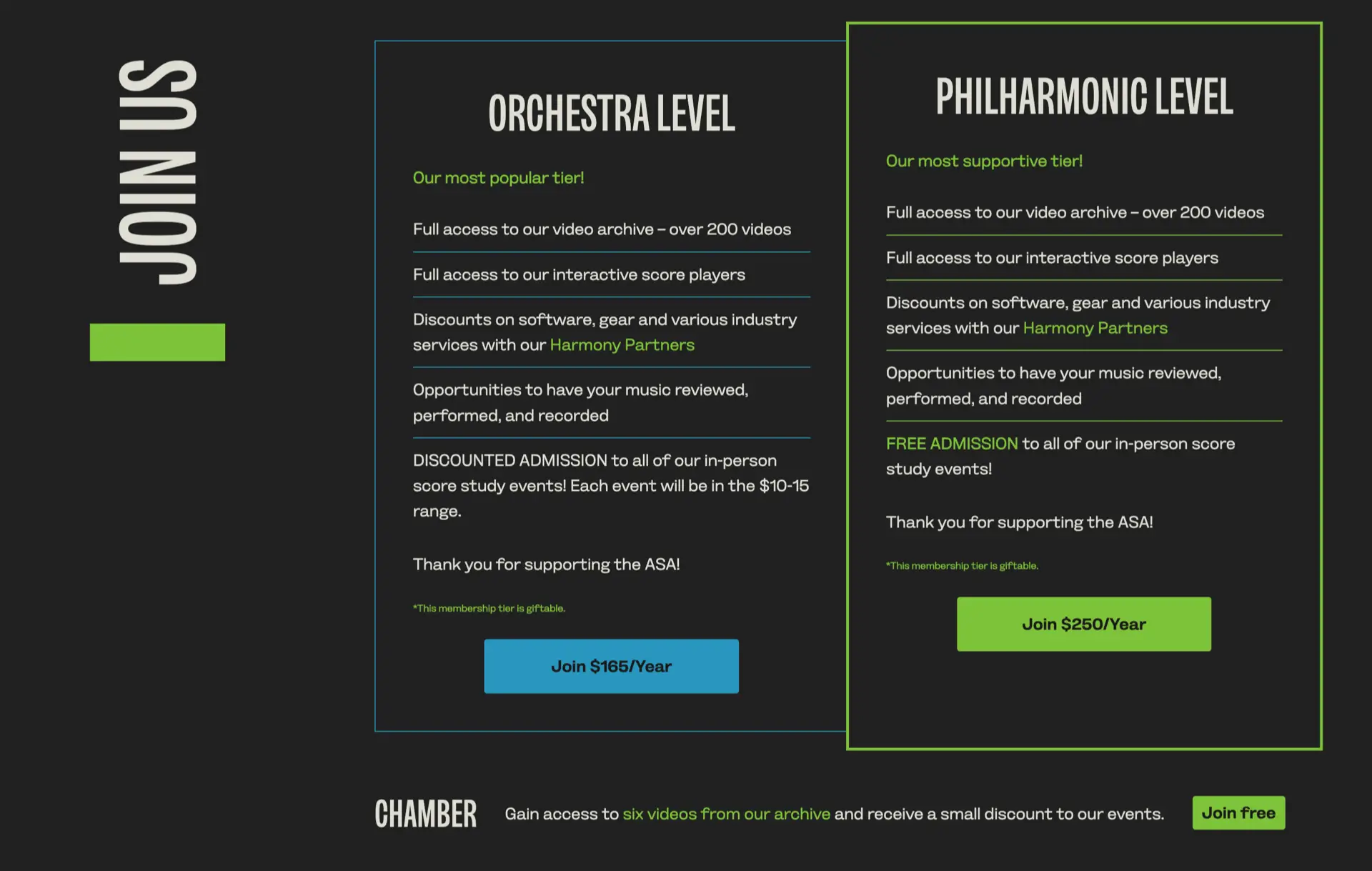
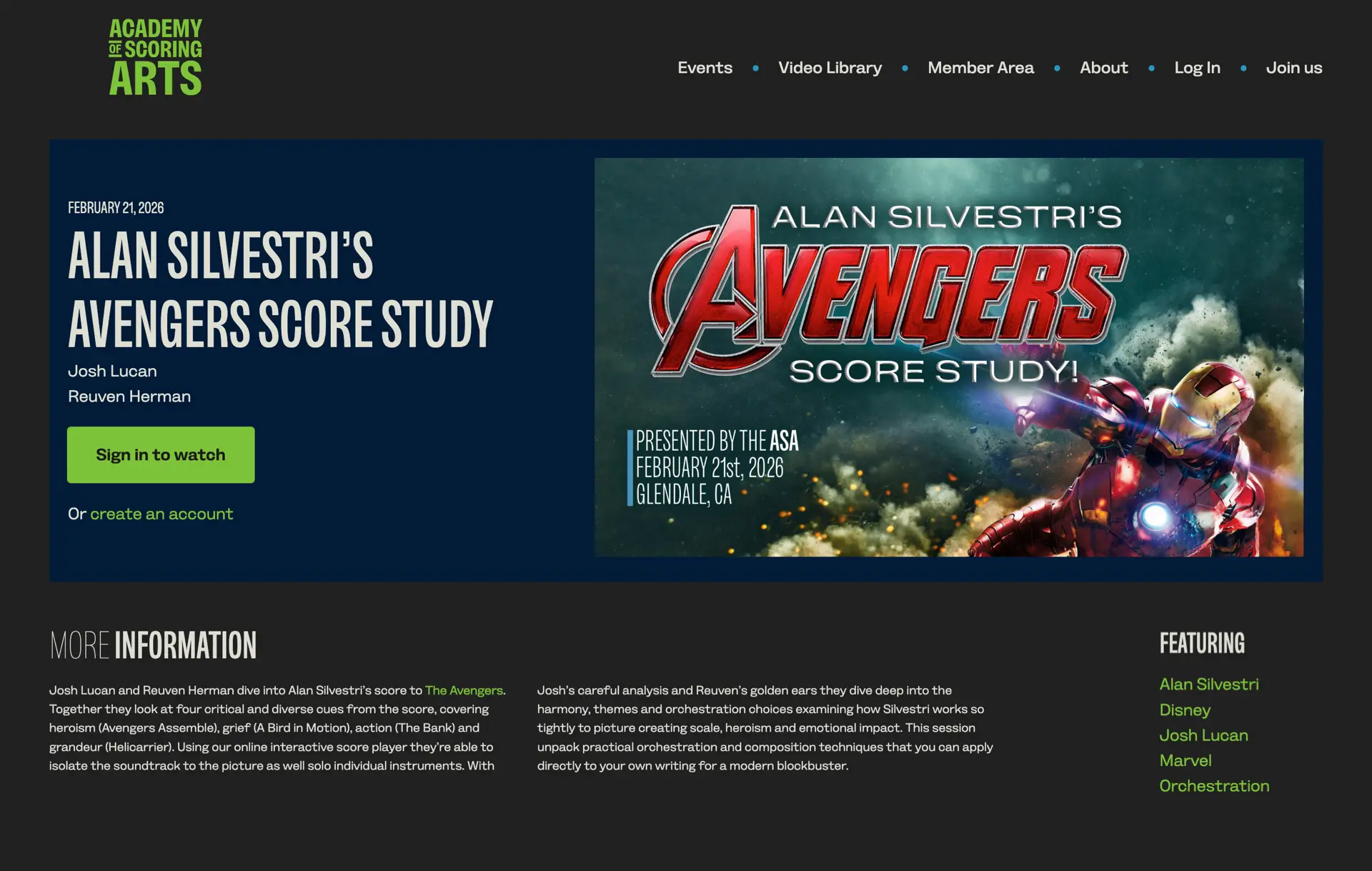
The most important goal of this project was to increase member sign-ups. That meant making the value of joining obvious, and reducing friction wherever possible. I focused on:
The result is a website that looks better—and works harder.
The interaction design for The Academy of Scoring Arts is subtle. There are no large animated elements, just micro-interactions and hover effects that add polish without distracting from the content.
This project reinforces something I believe strongly: even with conventional content and a standard grid, a website can feel distinctive, communicate clearly, and drive real results when design decisions are made with intent. I’m especially pleased at how well Sush Kelly implemented my design into the Academy’s WordPress CMS.
Websites like this, for The Academy of Scoring Arts, is the kind of work I like to focus on—designing websites for creative organisations where editorial layout, typography, and structure work together to improve clarity and conversion.
A premium Eleventy starter kit for designers and developers who want to spend less time setting up the same project structure and more time designing distinctive websites.
Contract Killer is plain and simple and there’s no legal jargon. It’s customisable to suit your business and has been used on countless web projects since 2008.
Free compound grid and modular grid layout generators, plus a set of HTML/CSS layout templates you can call on to make more interesting layouts, available to buy.