Eleventy in a Box
A premium Eleventy starter kit for designers and developers who want to spend less time setting up the same project structure and more time designing distinctive websites.
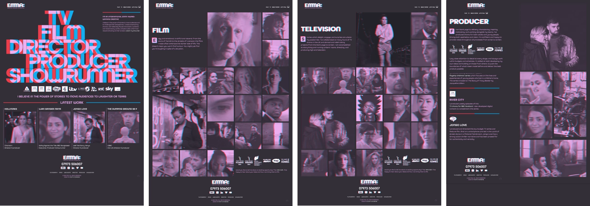
Emma Bodger is a film/television producer, and recently, I’ve spent time working on her visual identity and a new website. It’s been a lot of fun, and I also learned a few things while working on it. I’m digging into the details this week, and today I’ll explain the pseudo-3D design I created for Emma’s home page banner.
While we were discussing the work Emma does across media—from film, radio, and televisions—describing it as “multi-dimensional” made sense to us. I wondered about how I might make her new design multi-dimensional too and I struck on the idea of referencing the pseudo-3D anaglyph treatment which makes images appear three-dimensional while wearing red/cyan glasses.
First, to toggle any anaglyph effects on and off, I added a data- attribute to the root element:
<html data-effect="anaglyph-on">
<html data-effect="anaglyph-off">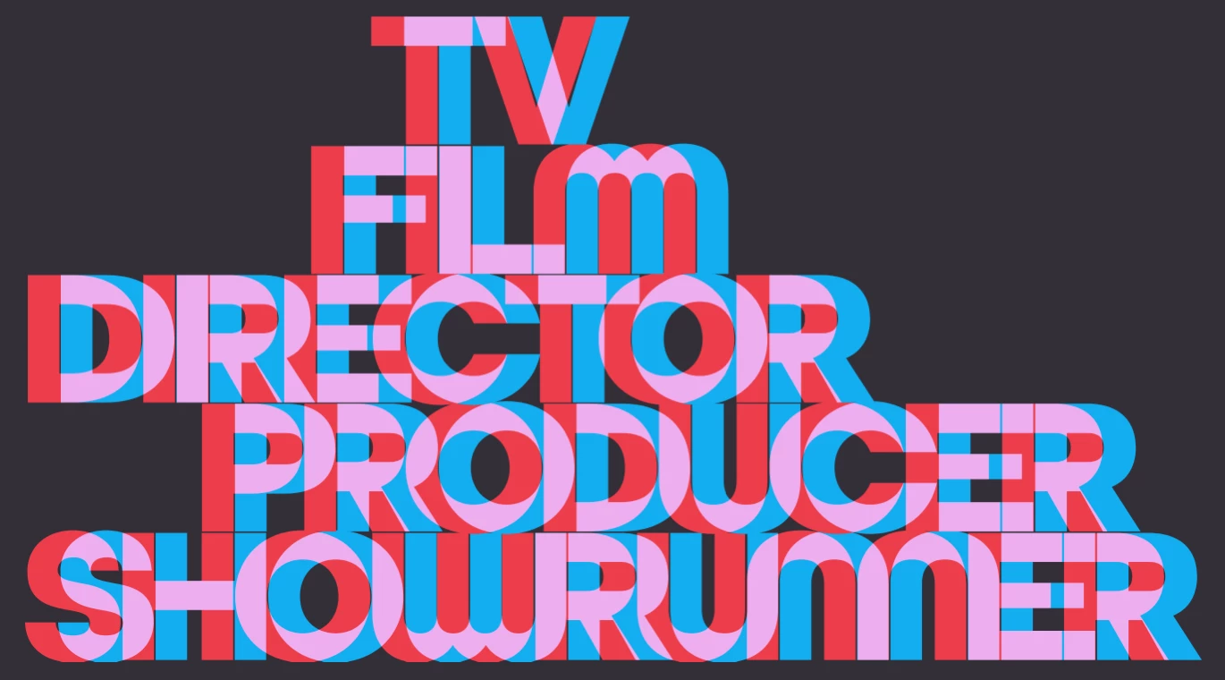
The large banner graphic on Emma’s home page is SVG with CSS transforms and transitions to add movement to the effect. Each of the five words consists of a set of three paths; red, cyan, and a white base colour:
<svg xmlns="http://www.w3.org/2000/svg" viewBox="0 0 1520 802" class="introduction">
<a href="" title="Showrunner">
<path class="color-red" fill="#ed3d4a" d="…"/>
<path class="color-cyan" fill="#11aeefF" d="…"/>
<path class="color-base" fill="#fff" d="…"/>
</a>
<a href="" title="Producer">…</a>
<a href="" title="Director">…</a>
<a href="" title="Film">…</a>
<a href="" title="Television">…</a>
</svg>
I wanted to give people the option to disable the pseudo-3D effects, including in this banner graphic. The color-base paths come at the end of the SVG source and obscure the red and cyan paths. For when the anaglyph effect is turned on, I offset the red and cyan paths and blended them to create the pink colour I used for the rest of my design. I moved the red path to the left:
[data-effect="anaglyph-on"] .introduction .color-red {
transform: translateX(-20px); }
And, the cyan path is moved to the right and blended with the red:
[data-effect="anaglyph-on"] .introduction .color-cyan {
transform: translateX(21px);
mix-blend-mode: lighten; }
When the anaglyph effect is on, I don’t need to see the white base path, so I reduced its opacity to 0;
[data-effect="anaglyph-on"] .introduction .color-base {
opacity: 0; }
When someone hovers over any part of the banner graphic, the transforms are removed and the paths move back smoothly to their default positions:
[data-effect="anaglyph-on"] .introduction path {
transition: fill var(--duration-quickly) ease-in-out; }
[data-effect="anaglyph-on"] .introduction:hover .color-red,
[data-effect="anaglyph-on"] .introduction:hover .color-cyan {
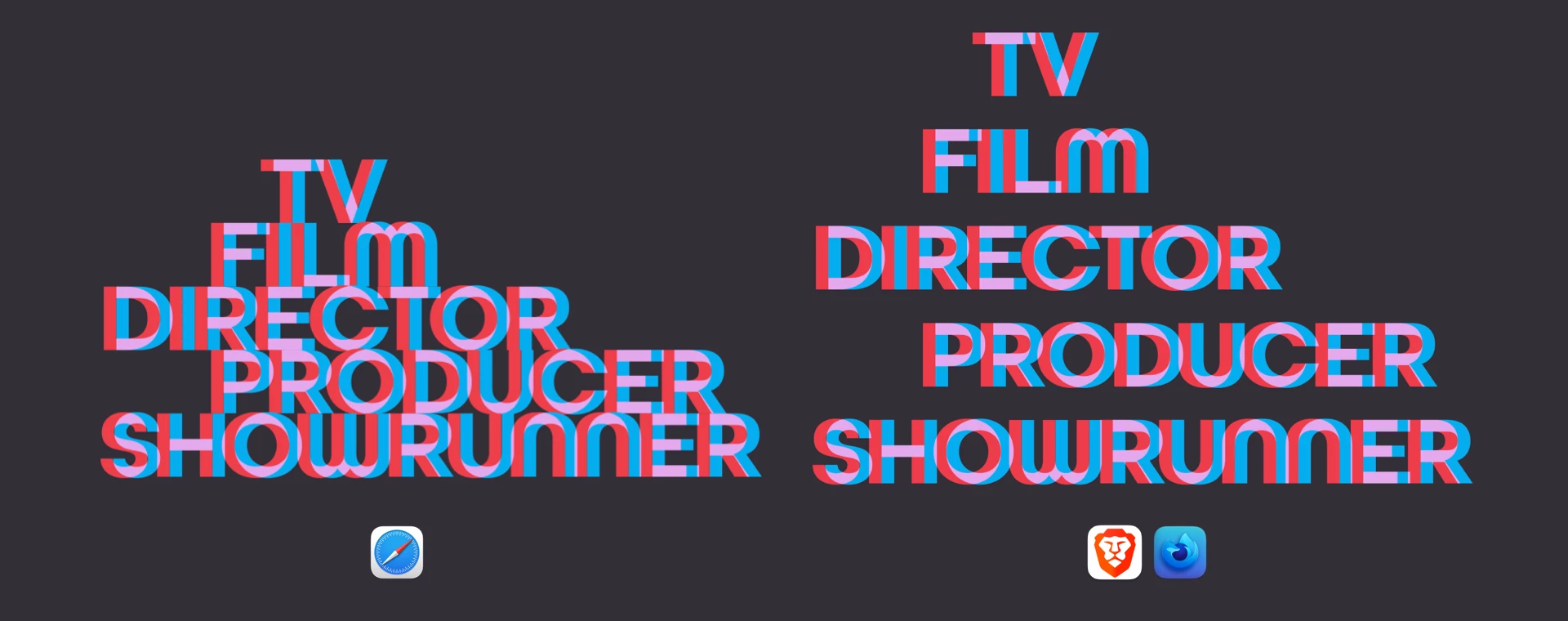
transform: translateX(0); }Although it’s made from type, I decided to develop this large banner graphic using SVG because of its ability to resize easily across screen sizes and precise control over its characters. But, I was curious about whether I could develop this banner anaglyph using HTML text and CSS. Doing that involved splitting a first-level heading element into multiple hyperlinks and adding a title attribute which repeats the link text:
<h1>
  <a href="" title="TV">TV</a>
  <a href="" title="Film">Film</a>
  <a href="" title="Director">Director</a>
  <a href="" title="Producer">Producer</a>
  <a href="" title="Showrunner">Showrunner</a>
</h1>
First, I styled those links inside the heading element. I used a container query length unit (cqi) which is 15% of the heading’s container. I used a cqi unit again to add negative tracking (letter-spacing:)
h1 a {
display: block;
position: relative;
font-size: 15cqi;
letter-spacing: -.05cqi; }
leading-trim is a new CSS property which crops off the extra spacing above and below characters reserved by a font and makes styling more predictable:
h1 a {
text-edge: cap alphabetic;
leading-trim: both; }
This uses another new property, text-edge, to instruct a browser that the edge of the link text should be the cap height and the alphabetic baseline and trims it above and below. Finally, I made the link text transparent:
h1 a {
color: transparent; }
Then, I used two pseudo-elements to replicate the anaglyph effect. These ::before and ::after pseudo-elements take their content from the title elements I added to each hyperlink. I positioned them absolutely and blended them together:
h1 a::before, h1 a::after {
content: attr(title);
position: absolute;
top: 0;
left: 0;
mix-blend-mode: lighten;
transition: all .5s ease-in-out; }
I move the ::before element to the left and add a red colour, then move the ::after element to the right and colour it cyan:
h1 a::before {
transform: translateX(-10px);
color: var(--color-red); }
h1 a::after {
transform: translateX(10px);
color: var(--color-cyan); }
To add movement to this text-based version of the home page banner, I reset the position of those two pseudo-elements when someone hovers over the heading and change their colour to white:
h1:hover a::before, h1:hover a::after {
transform: translateX(0);
color: #fff; }
Finally, to replicate the graphic feel of the banner design, I offset three of the hyperlinks using a character unit (ch)—which is defined by the width of the character 0—and target them using an attribute selector and their title elements:
[title="TV"] {
transform: translateX(3ch); }
[title="Film"] {
transform: translateX(2ch); }
[title="Producer"] {
transform: translateX(2ch); }
While this approach works well in Safari, results are less predictable in other browsers as—in March 2023—no other browsers have implemented leading-trim or text-edge. This makes SVG still the best solution for graphic text designs like the one I designed for Emma’s new website.
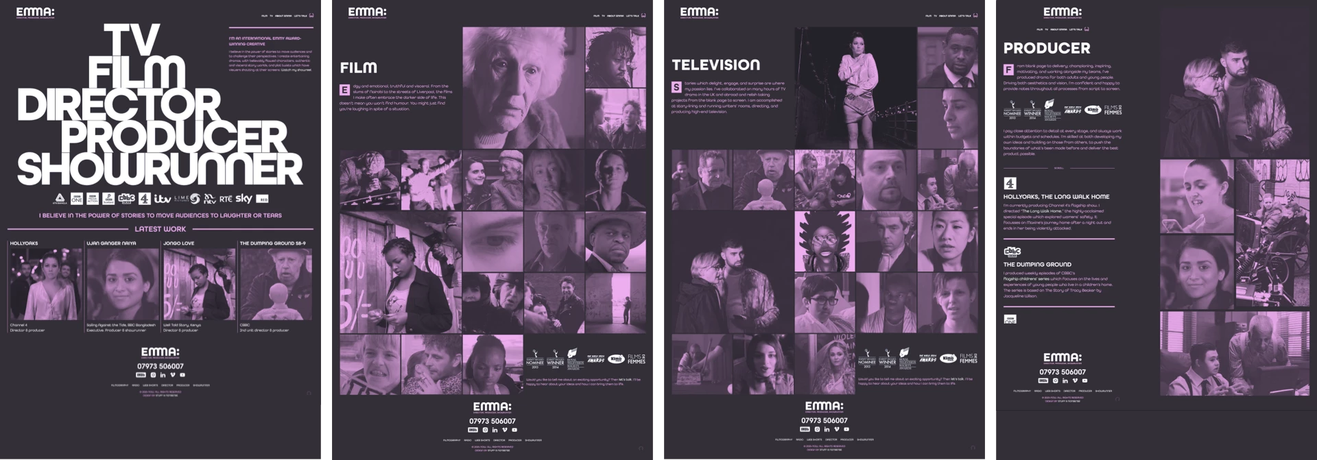
I hope you’ll take a good look at the new website I designed for Emma. If you do, you might also notice the anaglyph treatment I applied to her images using SVG filters:
[data-effect="anaglyph-on"] img {
filter: url("#anaglyph");
clip-path: inset(3px 3px); }
But, that’s the subject for tomorrow.
A premium Eleventy starter kit for designers and developers who want to spend less time setting up the same project structure and more time designing distinctive websites.
Contract Killer is plain and simple and there’s no legal jargon. It’s customisable to suit your business and has been used on countless web projects since 2008.
Free compound grid and modular grid layout generators, plus a set of HTML/CSS layout templates you can call on to make more interesting layouts, available to buy.