Eleventy in a Box
A premium Eleventy starter kit for designers and developers who want to spend less time setting up the same project structure and more time designing distinctive websites.
The Official Movie site for Dawn Of The Planet Of The Apes has launched and, chattering chimpanzees, is it a piece of work! As if I weren’t excited enough about the film. It’s not released until July 2014 but the site gives fans a taste of what’s happened since the end of Rise.
If we want to find out how the outbreak of Simian Flu has ravaged us humans we’ll need a large, modern browser.
The site has a ‘mobile’ version (with some sadly clipped and low-res non-retina sharing icons) so you might assume that version would form the basis of a small tablet version too. You’d be wrong. Hold an iPad mini in portrait orientation and you’ll see a message asking you to “Please rotate your device to landscape mode.”
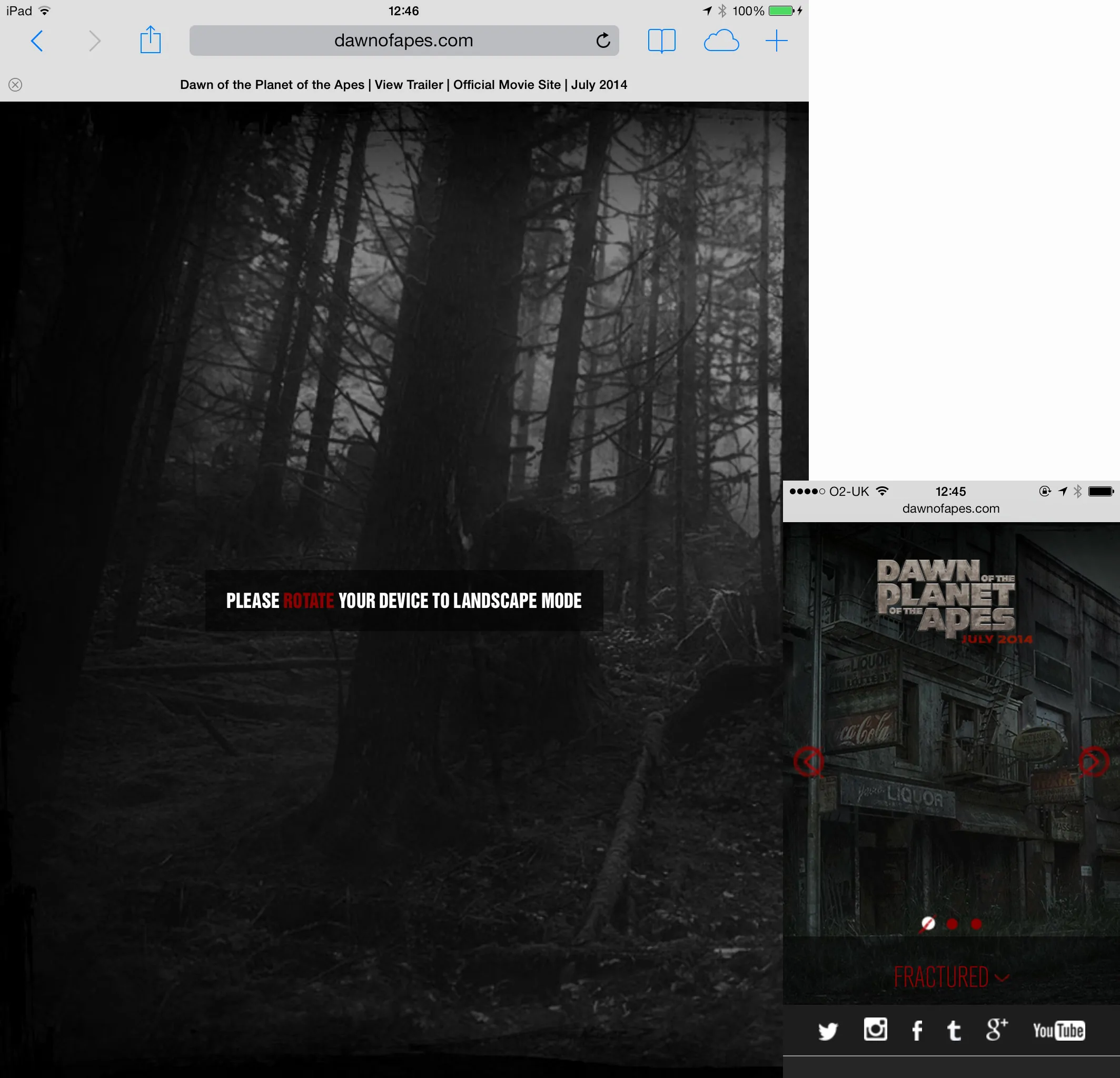
Although I know that some apes already use iPads, maybe other ape fingers are too big to use tablets? No, that’s not right because rotating an iPad into landscape orientation gives us access to the site’s content.
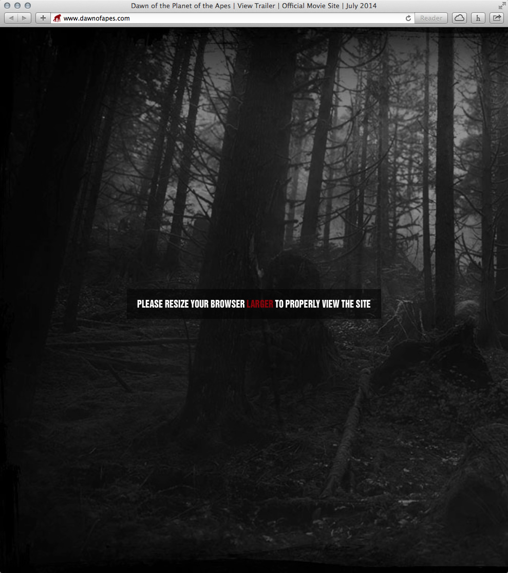
It’s a similar story on the desktop. The site’s content’s unavailable below a 990px breakpoint. If our viewport’s narrower than that we’re asked to “Please resize your browser larger to properly view the site.” Good luck if you want to mute the site’s background sounds as the controls are hidden at this size.
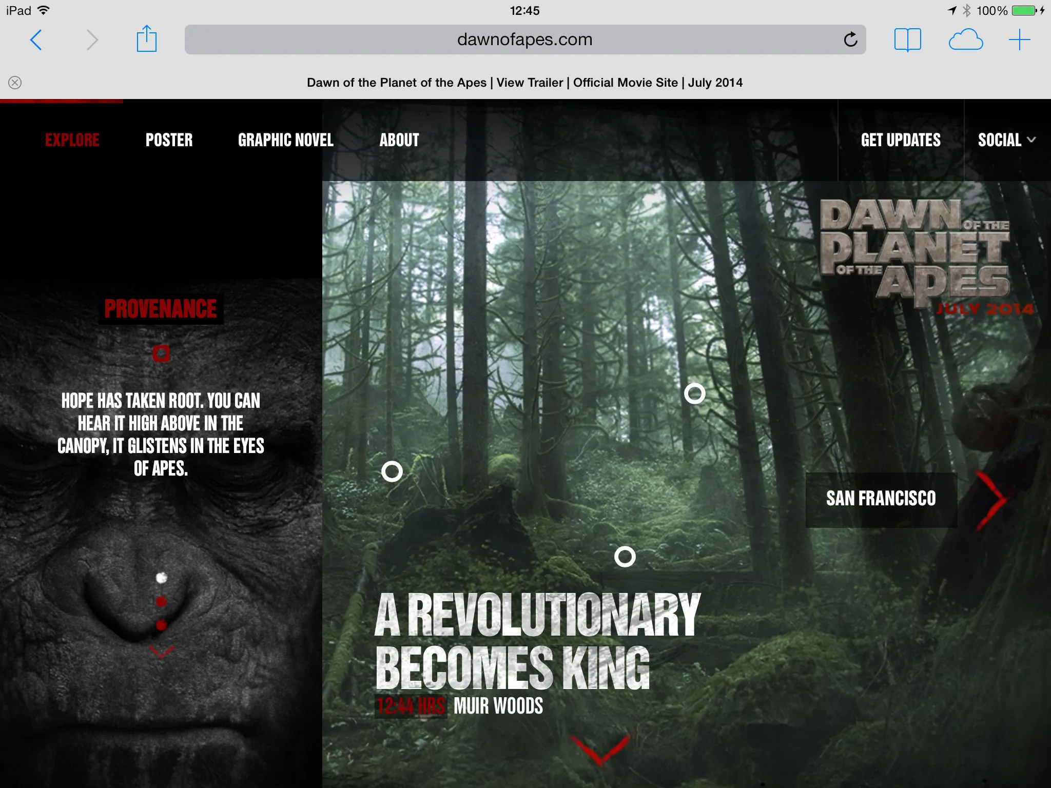
Still, there’s no argument that the site’s mightily impressive when you see it scaled large, really large.
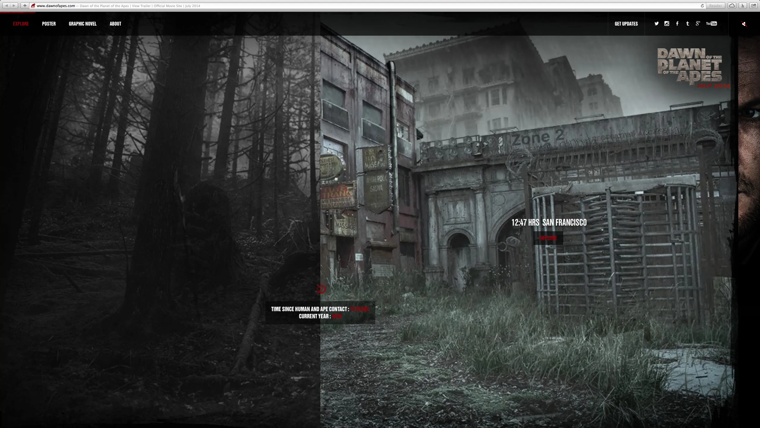
Taking care of very large screens is something we tried to do with our own apes (not connected of course, not at all) on the Stuff & Nonsense redesign last month too.
A couple of implementation details I noticed. First, both of the warnings I mentioned are written into the HTML:
‹div id="resize-rs" class="restriction"›
‹div class="container"›
‹h1›PLEASE RESIZE YOUR BROWSER‹span class="red"› LARGER ‹/span› TO PROPERLY VIEW THE SITE‹/h1›
‹/div›
‹/div›
‹div id="orientation-rs" class="restriction"›
‹div class="container"›
‹h1›PLEASE‹span class="red"› ROTATE ‹/span›YOUR DEVICE TO LANDSCAPE MODE‹/h1›
‹/div›
‹/div›
I wonder what impact that has on people who use screen readers?
One final point, as well as a large browser, the site requires a reasonably modern one too and has a browser upgrade warning for versions of Internet Explorer lower that 9. I can understand the reasoning behind that. I wouldn’t relish the task of working on a version of this site for IE8. In the site’s HTML.
‹!--[if lt IE 9]›
‹p class="lighter"›Please upgrade your browser to experience this site‹/p›
‹p›Select from the following supported browsers:‹/p›
‹ul class="browsers"›
‹li class="chrome"›‹a href="" target="_blank"›‹/a›‹/li›
‹li class="ff"›‹a href="" target="_blank"›‹/a›‹/li›
‹li class="safari"›‹a href="" target="_blank"›‹/a›‹/li›
‹li class="ie"›‹a href="" target="_blank"›‹/a›‹/li›
‹/ul›
‹p class="alsoVisit"›Also visit us on‹/p›
‹ul class="social"›
‹li class="twitter"›‹a href="" target="_blank"›‹/a›‹/li›
‹li class="instagram"›‹a href="" target="_blank"›‹/a›‹/li›
‹li class="facebook"›‹a href="" target="_blank"›‹/a›‹/li›
‹li class="tumblr"›‹a href="" target="_blank"›‹/a›‹/li›
‹li class="google"›‹a href="" target="_blank"›‹/a›‹/li›
‹li class="youTube"›‹a href="" target="_blank"›‹/a›‹/li›
‹/ul›
‹![endif]--›
I don’t agree with every implementation decision, but who am I to quibble? I’m just an excited apes fan and because of that I bet you won’t be surprised when I say that I love this site. Is it July yet?
A premium Eleventy starter kit for designers and developers who want to spend less time setting up the same project structure and more time designing distinctive websites.
Contract Killer is plain and simple and there’s no legal jargon. It’s customisable to suit your business and has been used on countless web projects since 2008.
Free compound grid and modular grid layout generators, plus a set of HTML/CSS layout templates you can call on to make more interesting layouts, available to buy.