Eleventy in a Box
A premium Eleventy starter kit for designers and developers who want to spend less time setting up the same project structure and more time designing distinctive websites.
The Stuff and Nonsense nutty boys header is pretty tall and I decided I wanted to reduce its height for small screens, such as phones, in landscape orientation. When I wrote the CSS to make this happen I made some nutty assumptions. In the spirit of sharing our mistakes:
The header’s fluid and introduces more nutty boys as the viewport width allows. I serve what I assume to be phone screens a parallel set of styles to reduce the header size. I currently do this with a filthyModernizr hack and a CSS media query.
First I made the nutty assumption that phones have touch screens so I use Modernizr to test for that capability and if positive add a .touch class.
.touch {
/* Styles */
}
Then I assumed that phones have small screens (or small viewport sizes).
I launched our responsive mods before the iPhone 5. At that time I reduced the header size using a media query that quarantined reduction styles to touch screens no larger than the then iPhone’s landscape 480px.
@media only screen
and (max-width: 480px) {
.touch {
/* Styles */
}
}
When the iPhone 5 was released I soon found its landscape 568px meant that its users missed out on the reduction styles, so I naively increased the media query’s max-width to a generous 599px, assuming that phones stopped and tablets began at 600px.
@media only screen
and (max-width: 599px) { }
I later carried these assumptions to our nutty boys header. I also assumed that someone using a small touch screen would only ever see two characters as that’s what I see on my iPhone 4S. So I wrote reduction styles for just the first two characters.
@media only screen
and (max-width: 599px) {
.touch {
.madness {
background-image : url(banner-madness-lg-2x.png);
@include background-size(726px 327px);
.madness__m {
transform : translate(20px,0);
width : 175px;
height : 327px;
background-image : url(madness__m-lg-2x.png);
background-size : 175px 233px; }
.madness__a {
transform : translate(40px,0);
width : 248px;
height : 327px;
background-image : url(madness__a-lg-2x.png);
background-size : 248px 327px; }
}/*madness*/
}/*touch*/
}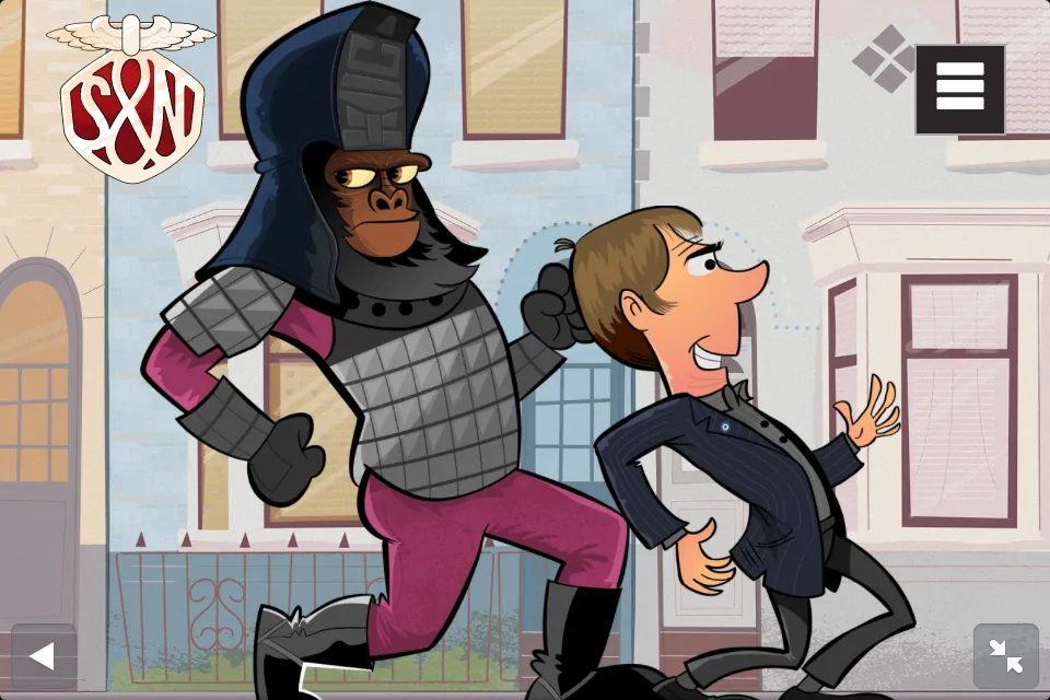
The week before launching our nutty boys, I checked the header on an iPhone 5 and had a nasty surprise. I could see three characters and without reduction styles the third was out of scale with the rest.
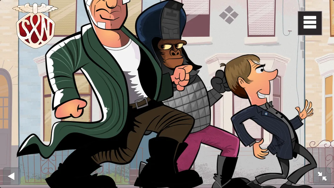
So I shrank Marv down to match the others, assuming that someone using a slightly larger small touch screen would only ever see three characters.
@media only screen
and (max-width: 599px) {
.touch {
.madness {
.madness__m { /* Styles */ }
.madness__a { /* Styles */ }
.madness__d {
width : 214px;
height : 272px;
background-image : url(madness__d-lg-2x.png);
background-size : 214px 272px; }
}/*madness*/
}/*touch*/
}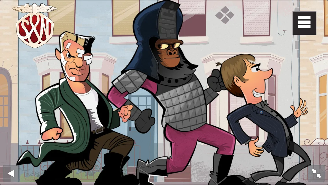
Yesterday I checked the header on a Sony Xperia phone and had another nasty surprise. I could see four characters and without reduction styles the fourth was out of scale with the rest.
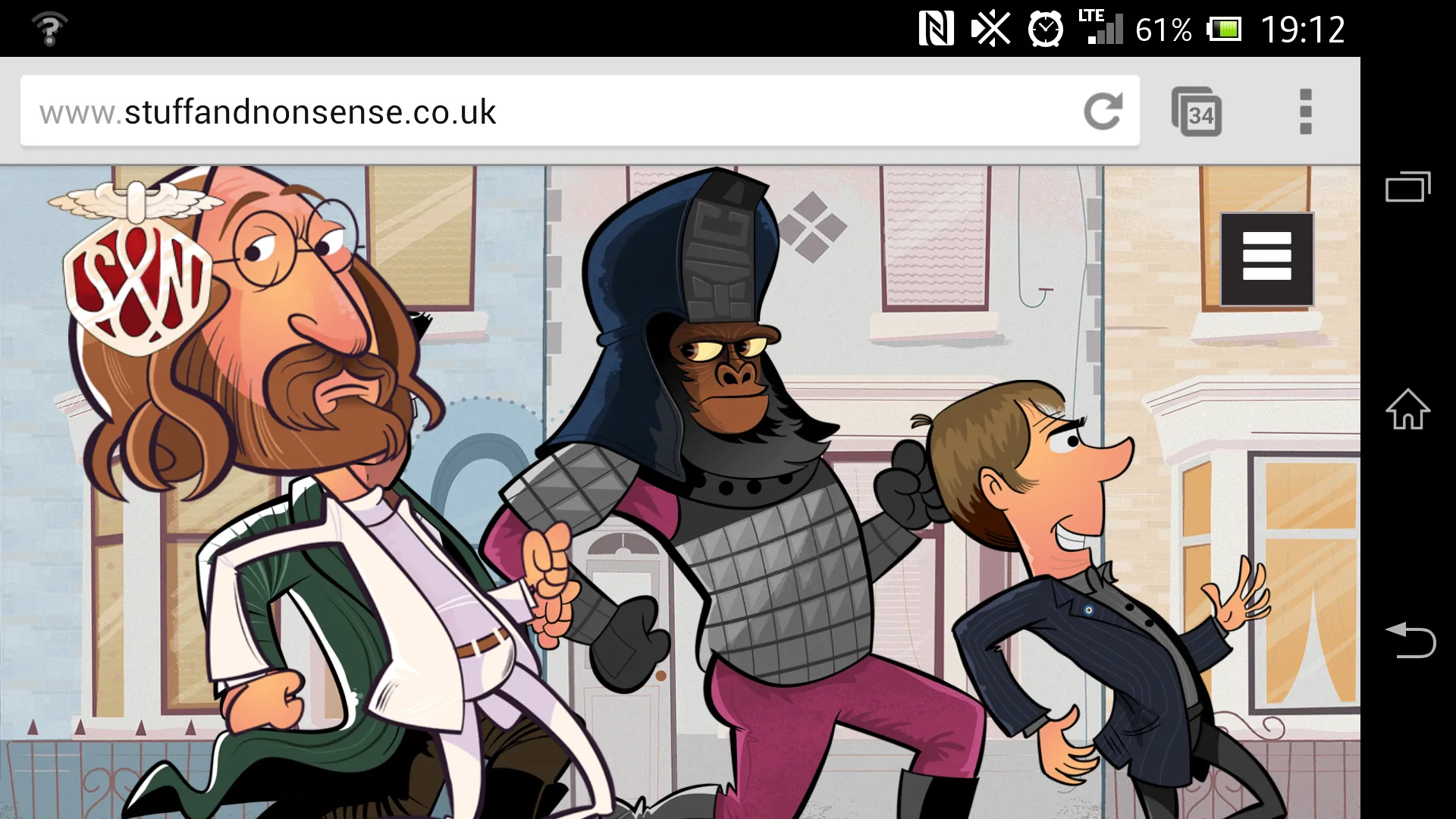
But before I shrink Lennon down to match the rest — assuming that someone using a larger small touch screen will only ever see four characters — I think I need to fix my assumptions before I fix my CSS.
I’m still figuring out what to do next, so if you’ve a good idea how I can accomplish what I want to do, please let me know. I’m all ears.
A premium Eleventy starter kit for designers and developers who want to spend less time setting up the same project structure and more time designing distinctive websites.
Contract Killer is plain and simple and there’s no legal jargon. It’s customisable to suit your business and has been used on countless web projects since 2008.
Free compound grid and modular grid layout generators, plus a set of HTML/CSS layout templates you can call on to make more interesting layouts, available to buy.